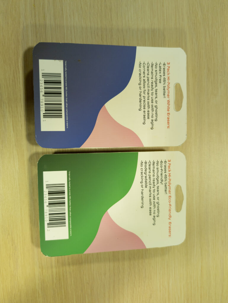
When tasked with making a logo and packaging for the Eraser Brand line up of offerings, the first step is to get a proper logo done. The first thing to be done is logo exploration. After looking at other similar brands and their logos and designs, I was able to better ascertain what the logo should be like for the Eraser Brand. After this I moved on to creating logo concepts.
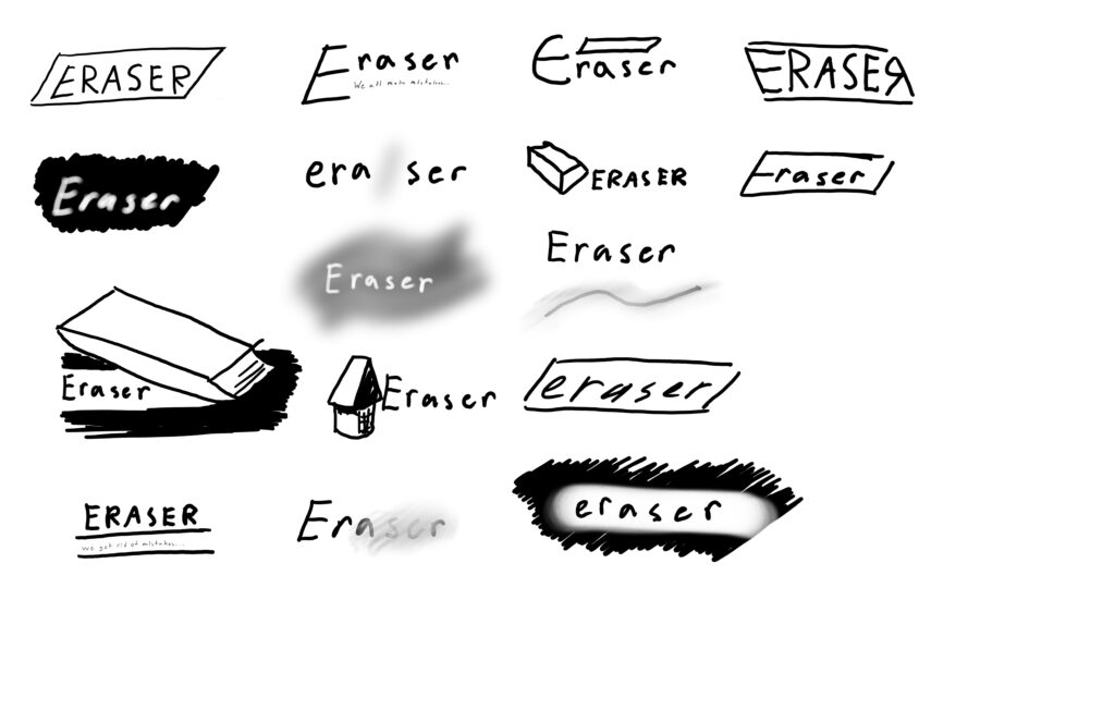
Once I had a slew of concepts, I began to continue developing them into a more concrete concept for the logo.
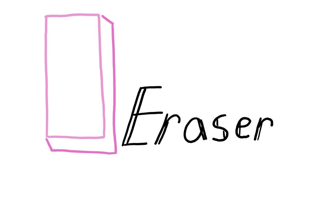
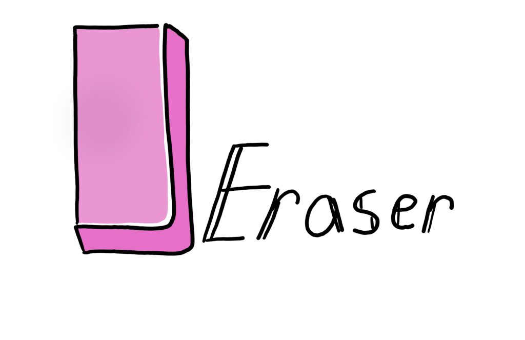
From there I developed a finalized logo for the Eraser Brand. The logo had a color version, black on white, and white on black. This allows the logo to be used in a variety of different scenarios depending on what is needed.

Once the logo had been completed, I could move on to packaging. The first step was to once again go out and ascertain what the competitors were doing for packaging and seeing what options there were moving forward. This is where real world research was important and helped more than ever to pick out what the packaging would be for the Eraser Brand.
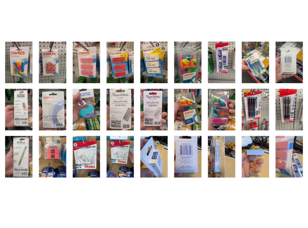
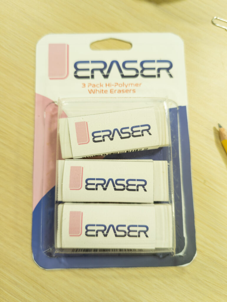
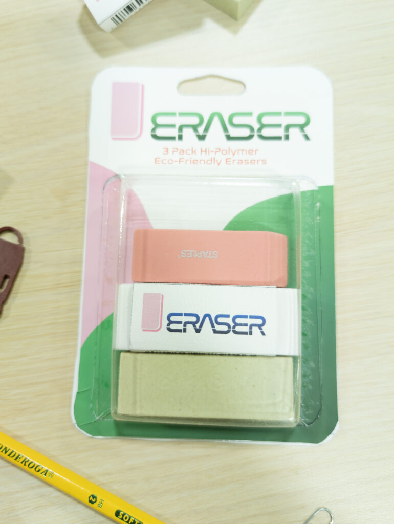
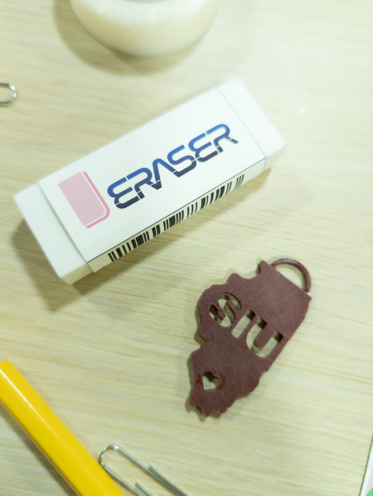
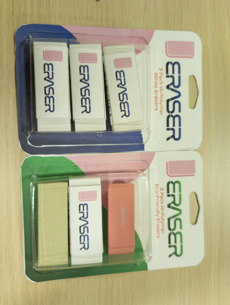
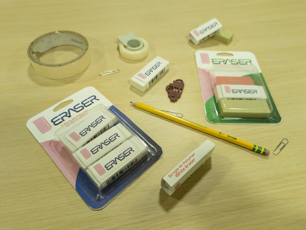
Packaging exploration led me to decide on a few different things for the packaging. The first was deciding on what products would be offered. I decided on single erasers, a pack of three white erasers, and a pack one each of white, green, and pink erasers. I also decided on using a sleeve for the singles, and a paper and plastic package for the three packs. To develop the plastic for the final packaging, I would have to research vacuum forming techniques and develop my own mold.
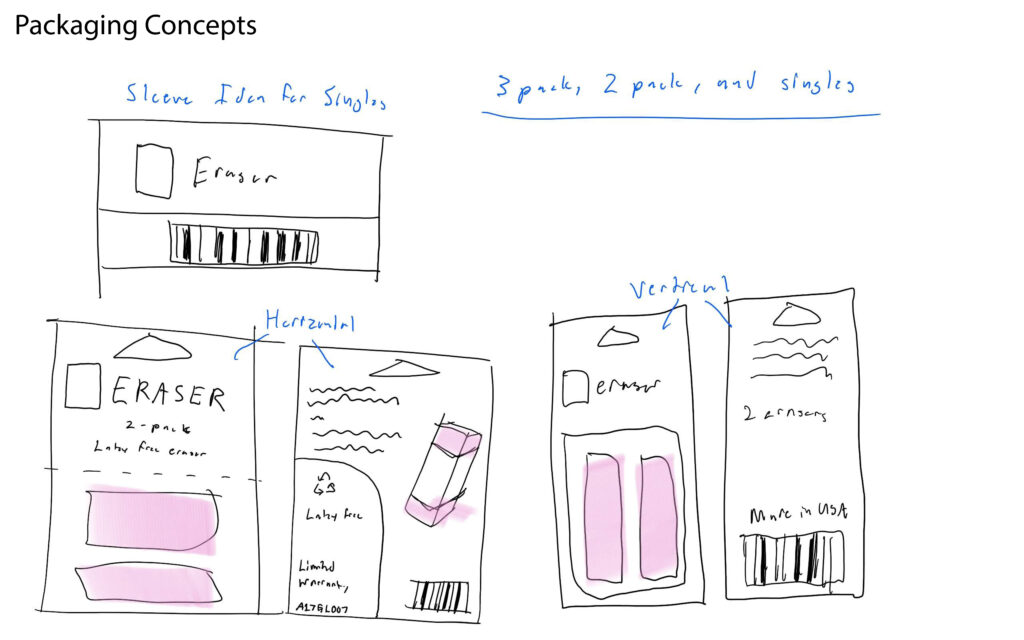
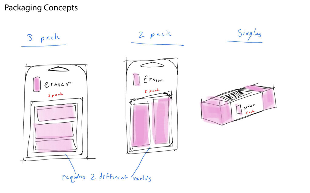
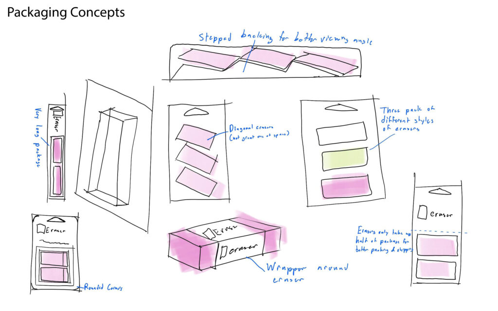
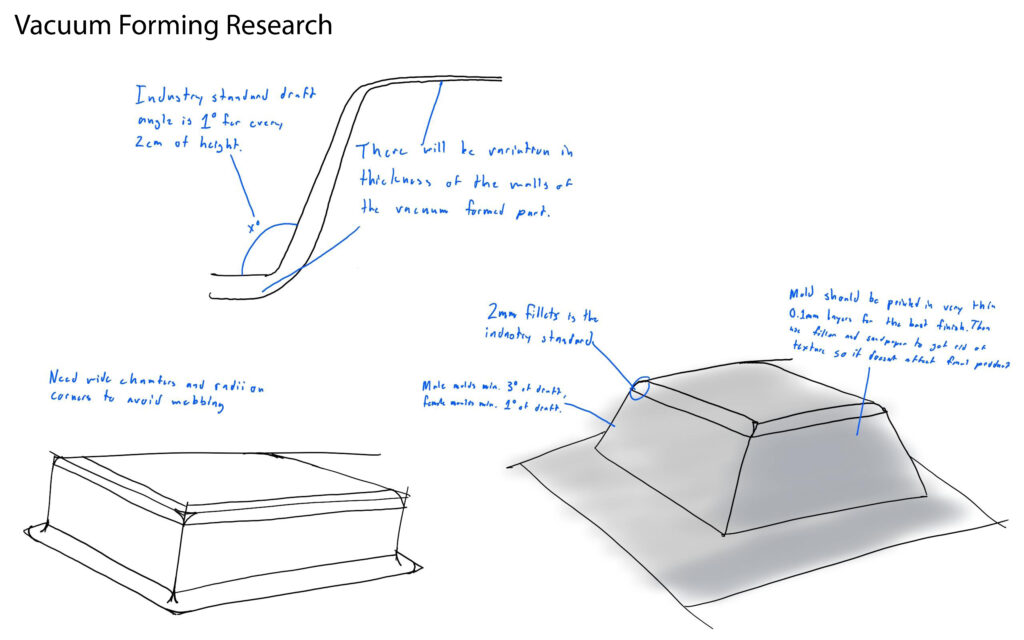
Developing the final paper part of the packaging resulted in two distinct packages and an eraser sleeve.

Assembly of the final packaging commenced and completed with the three different concepts for packaging, the two three packs and the single sleeved eraser.
